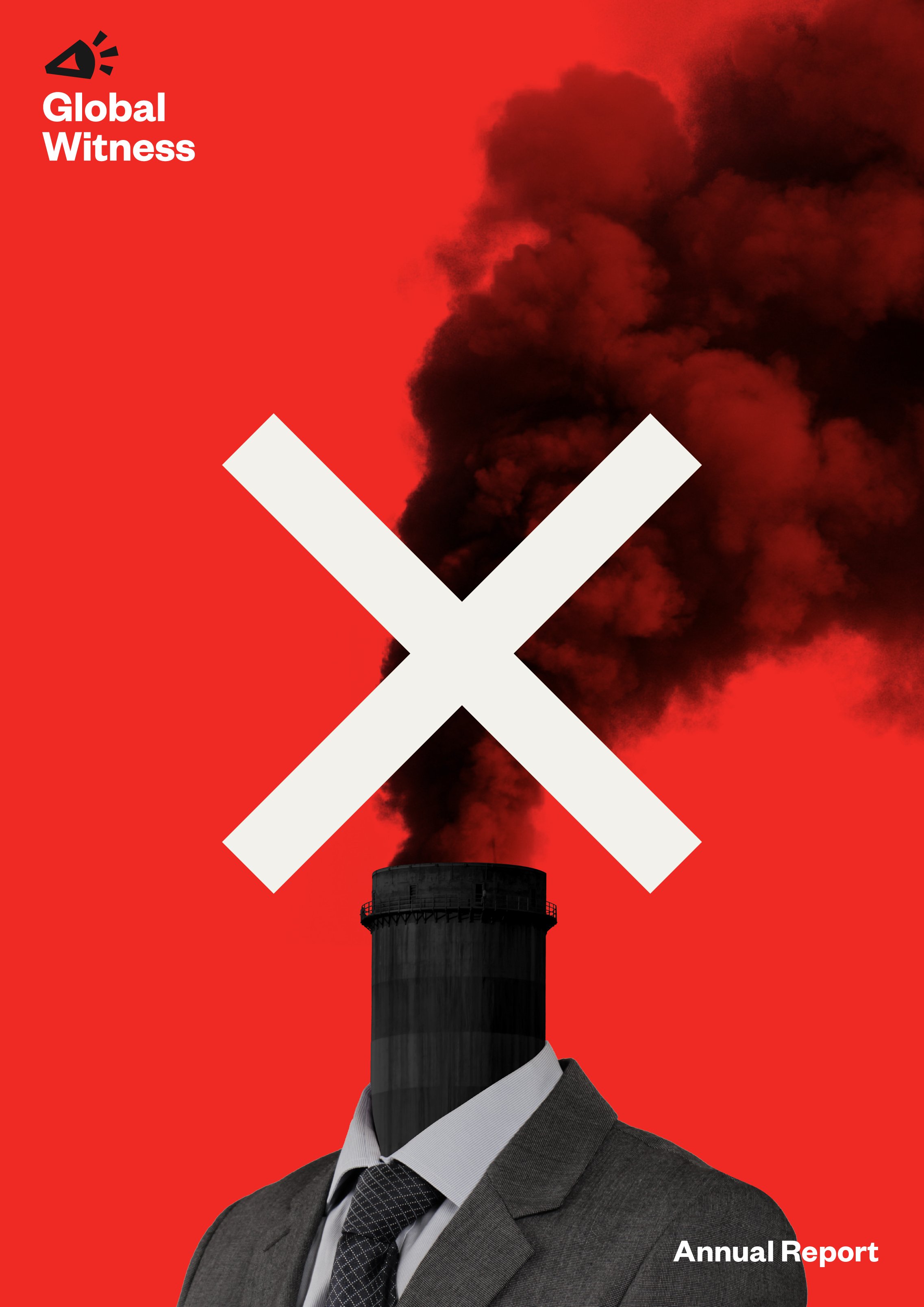
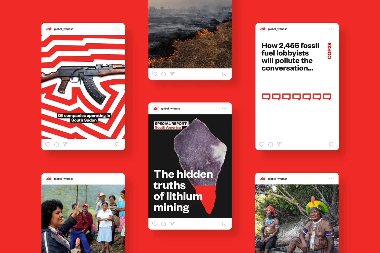
Exposing the industries fuelling the climate crisis
Brand articulation
Visual identity
Verbal identity
Campaign direction
Motion principles
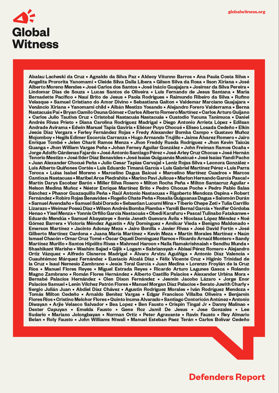
Guardianship

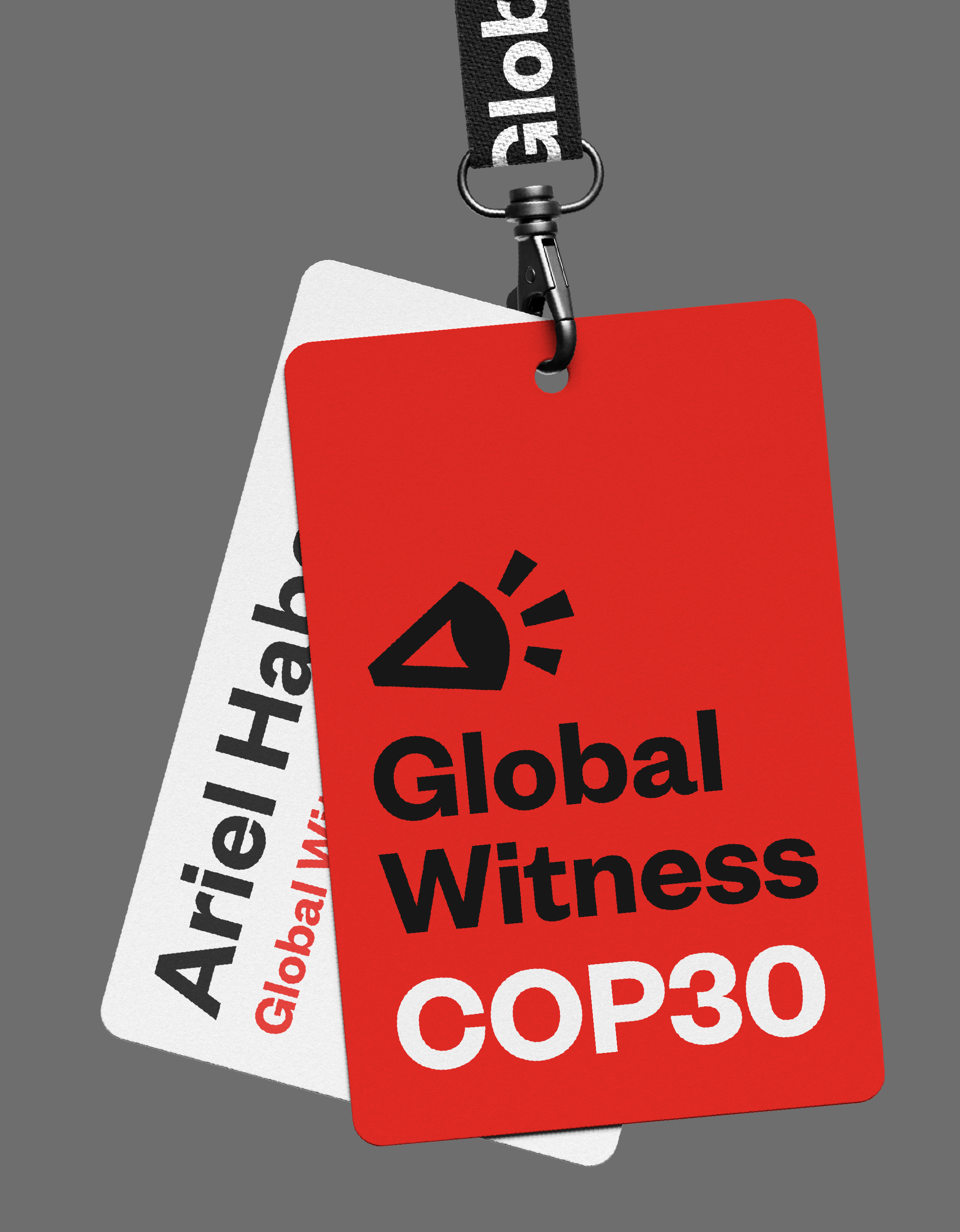
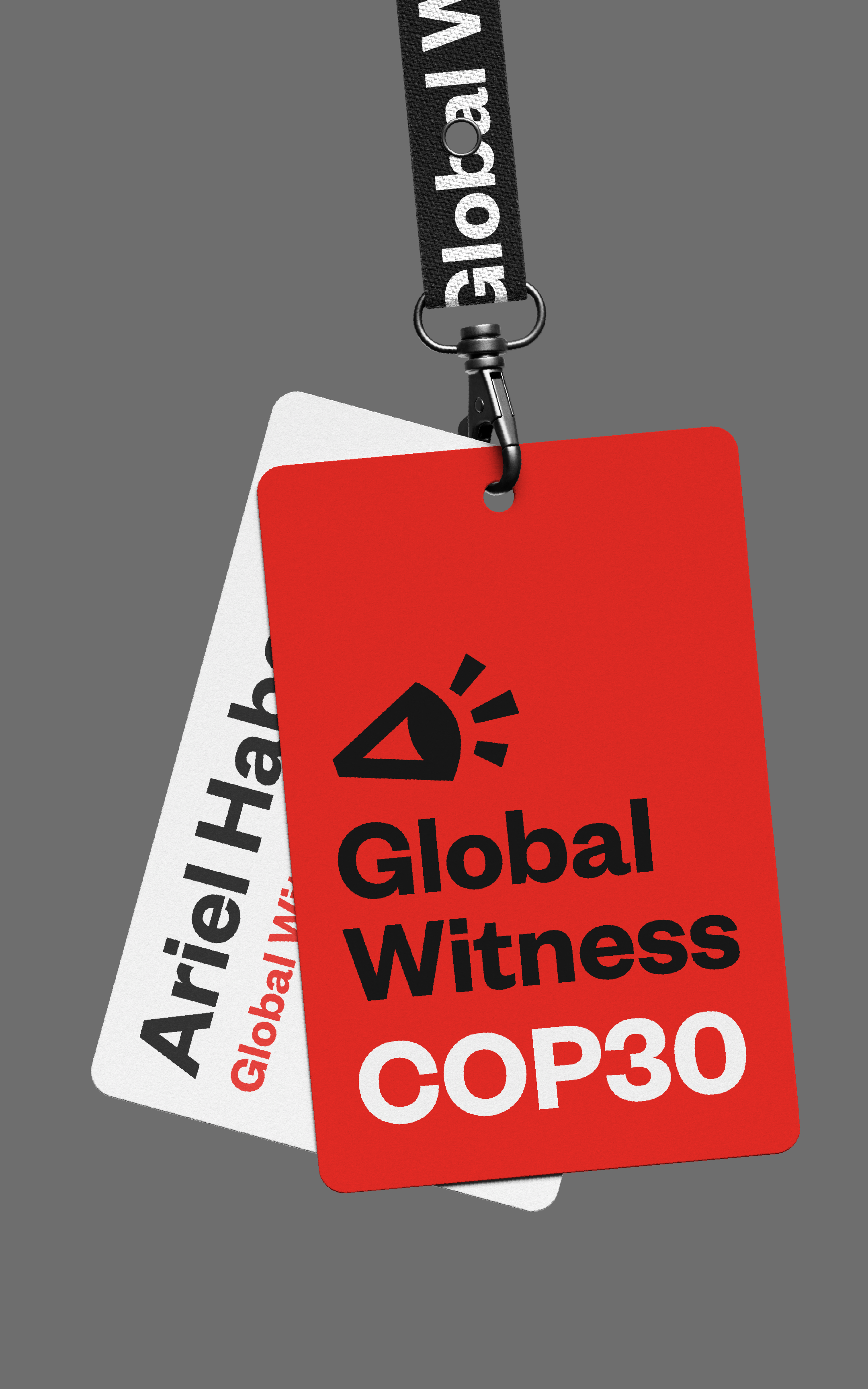
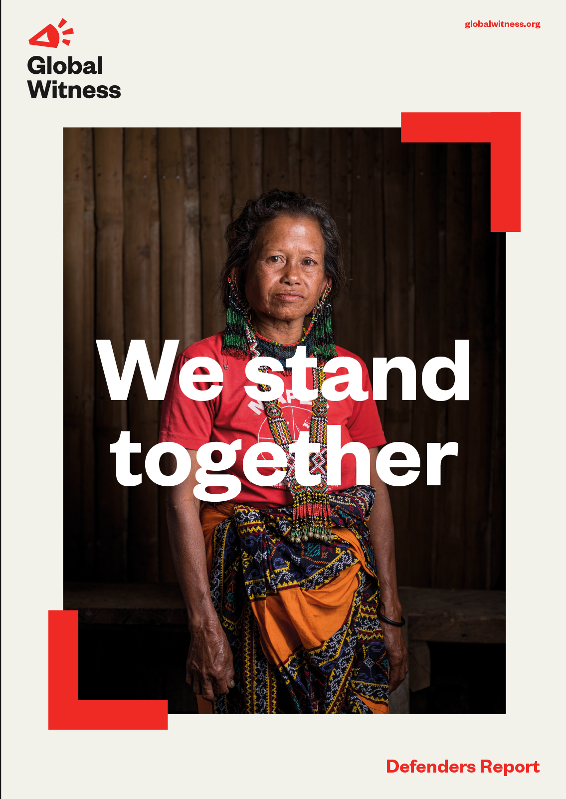
A universal, recognisable symbol to ‘see and speak the truth’. A logo to represent both the investigative and campaigning roles of Global Witness.
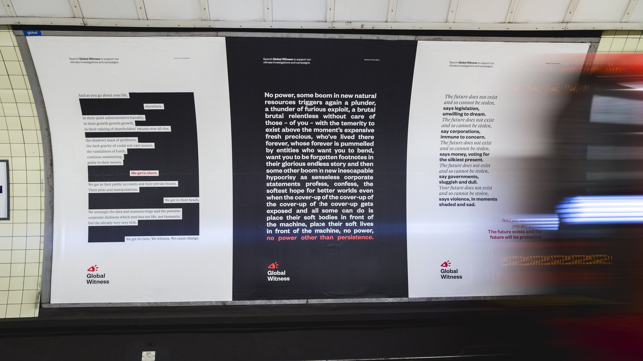
The new design system is grounded in an editorial-like approach that gives clarity and space to every issue. It highlights what’s important, alongside in-depth analysis – helping to make information, however complex, easier to engage with and understand.
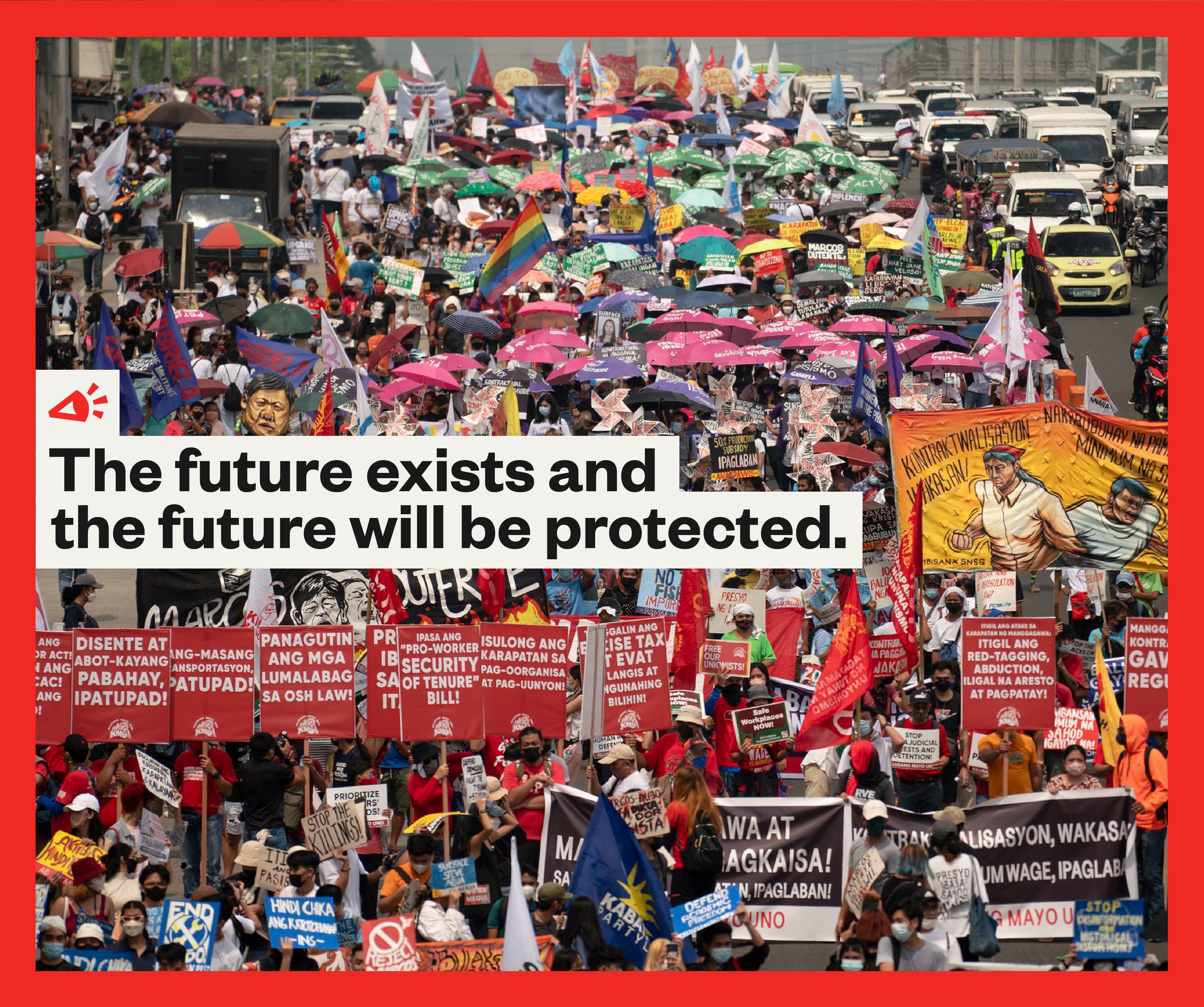
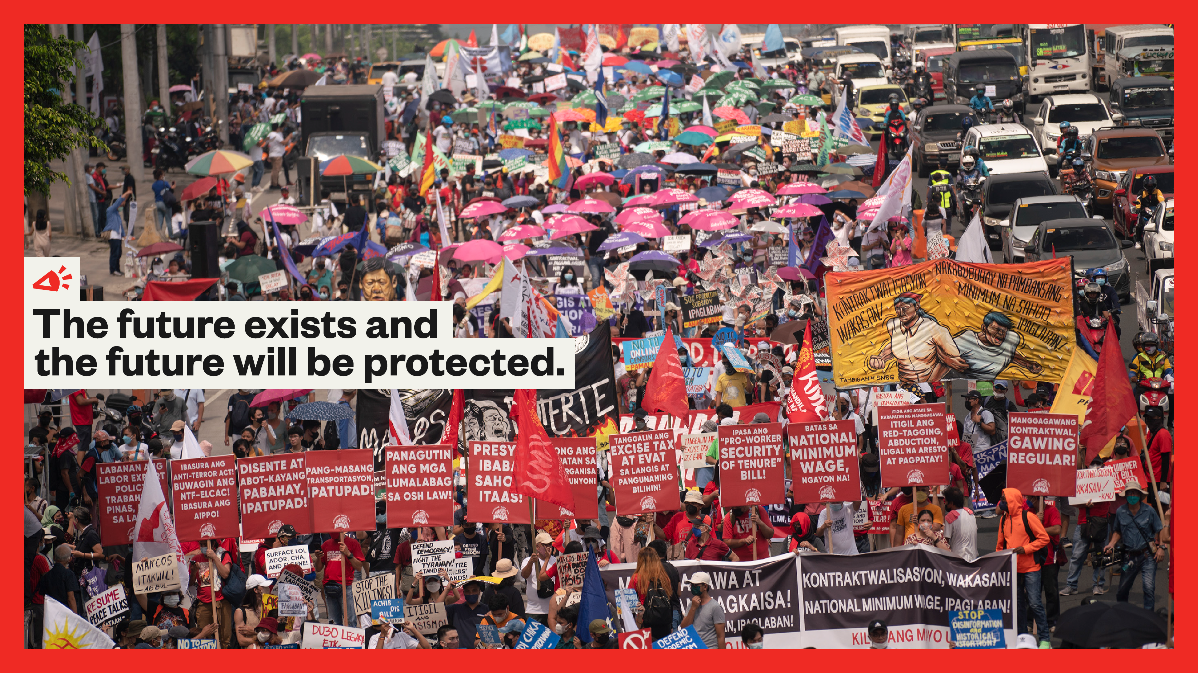
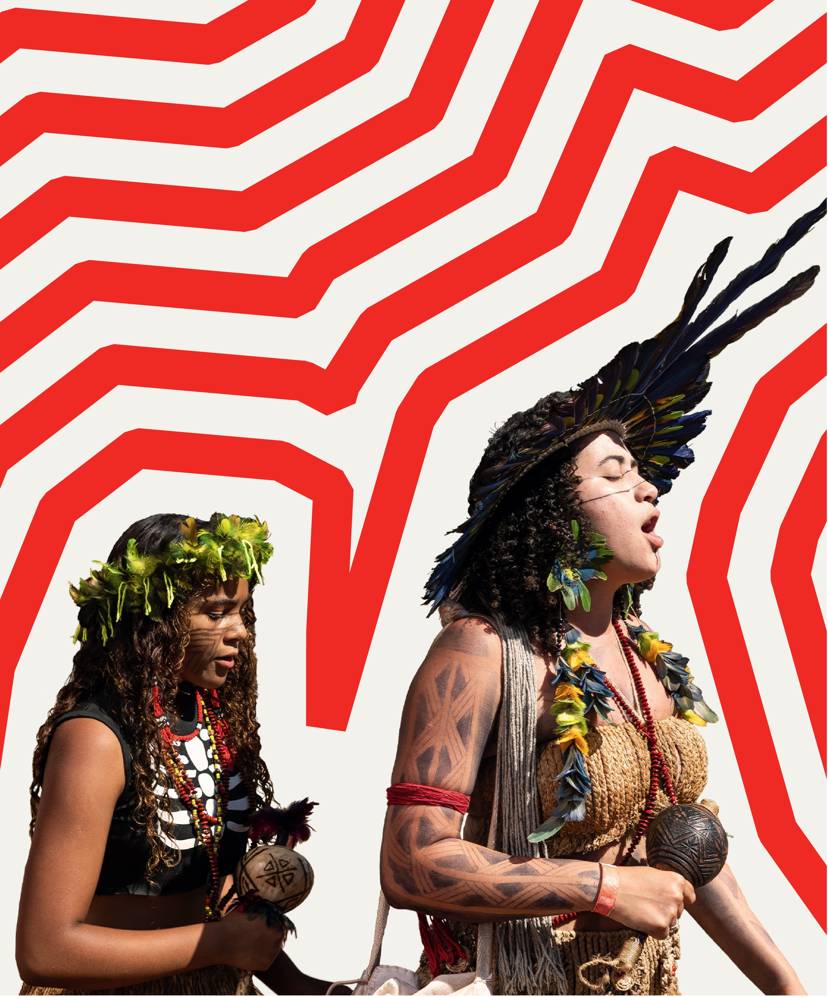
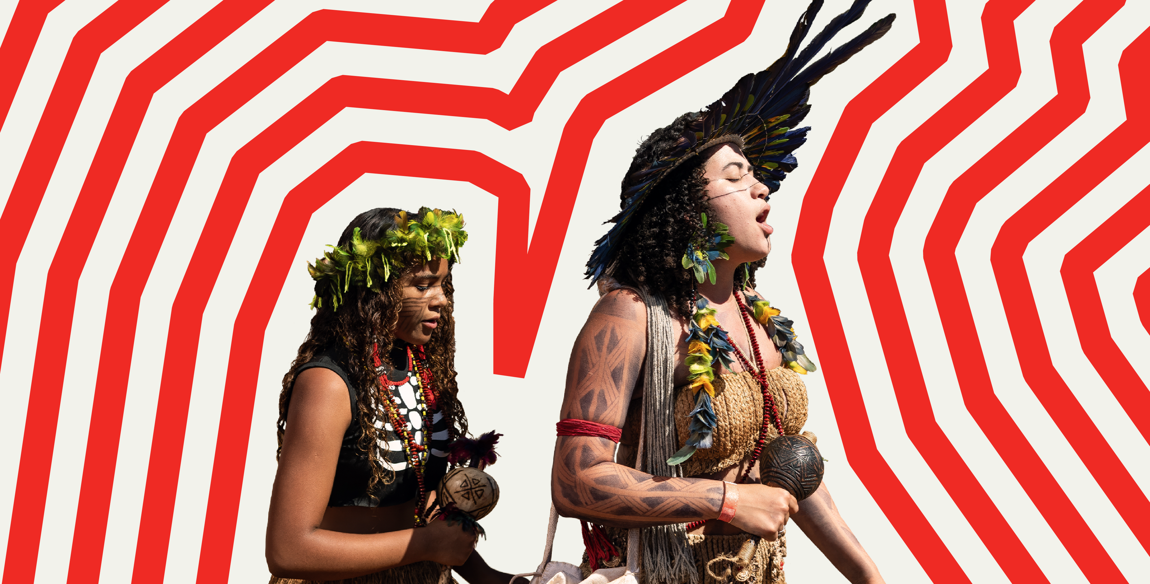
The brand always works in service of the real human story. Flexible design tools allow it to speak with authority, or sit back and support. Everything respects the urgency of the climate crisis: not by trying to shout loudest, but by meticulously presenting hard-hitting evidence and insight.
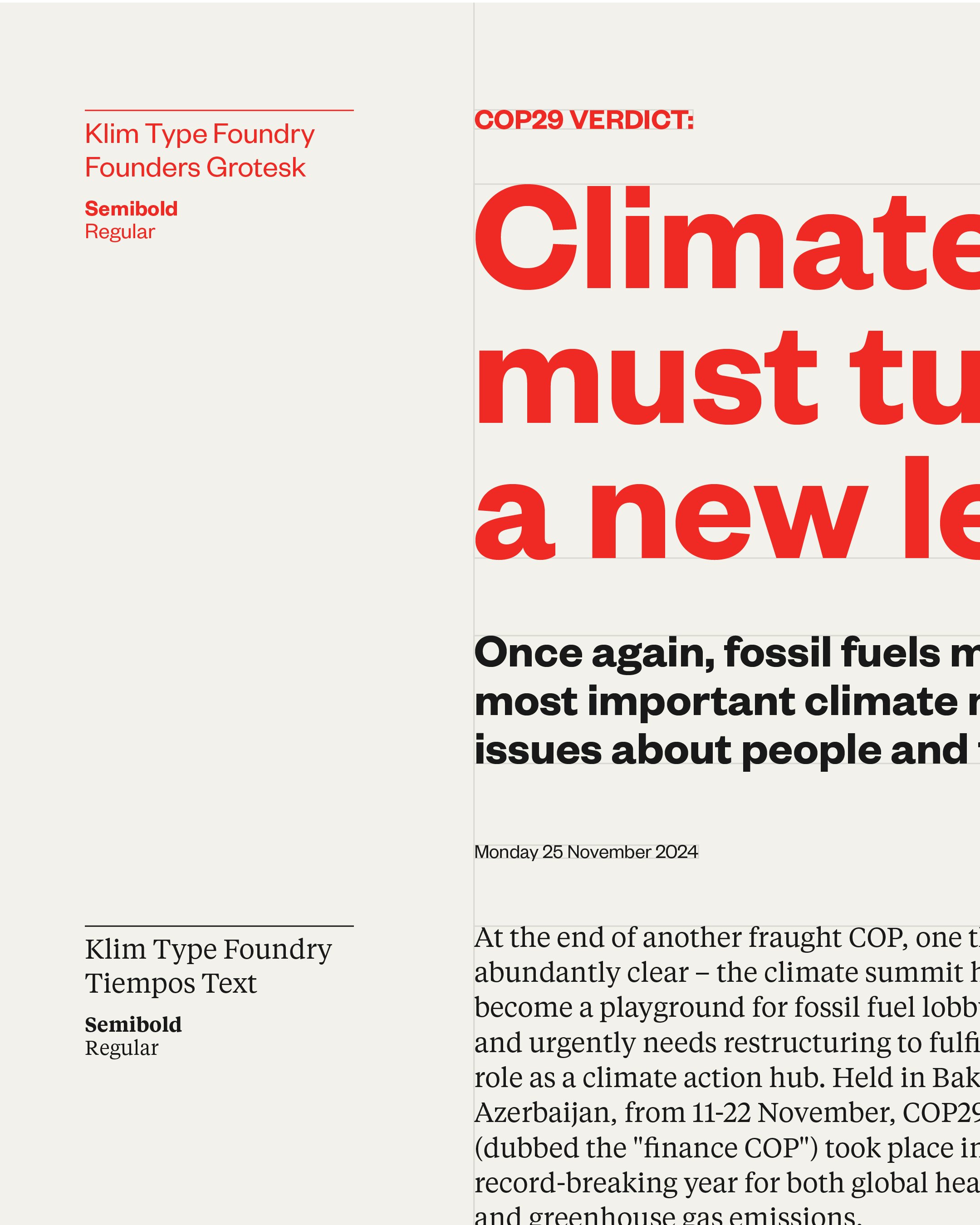
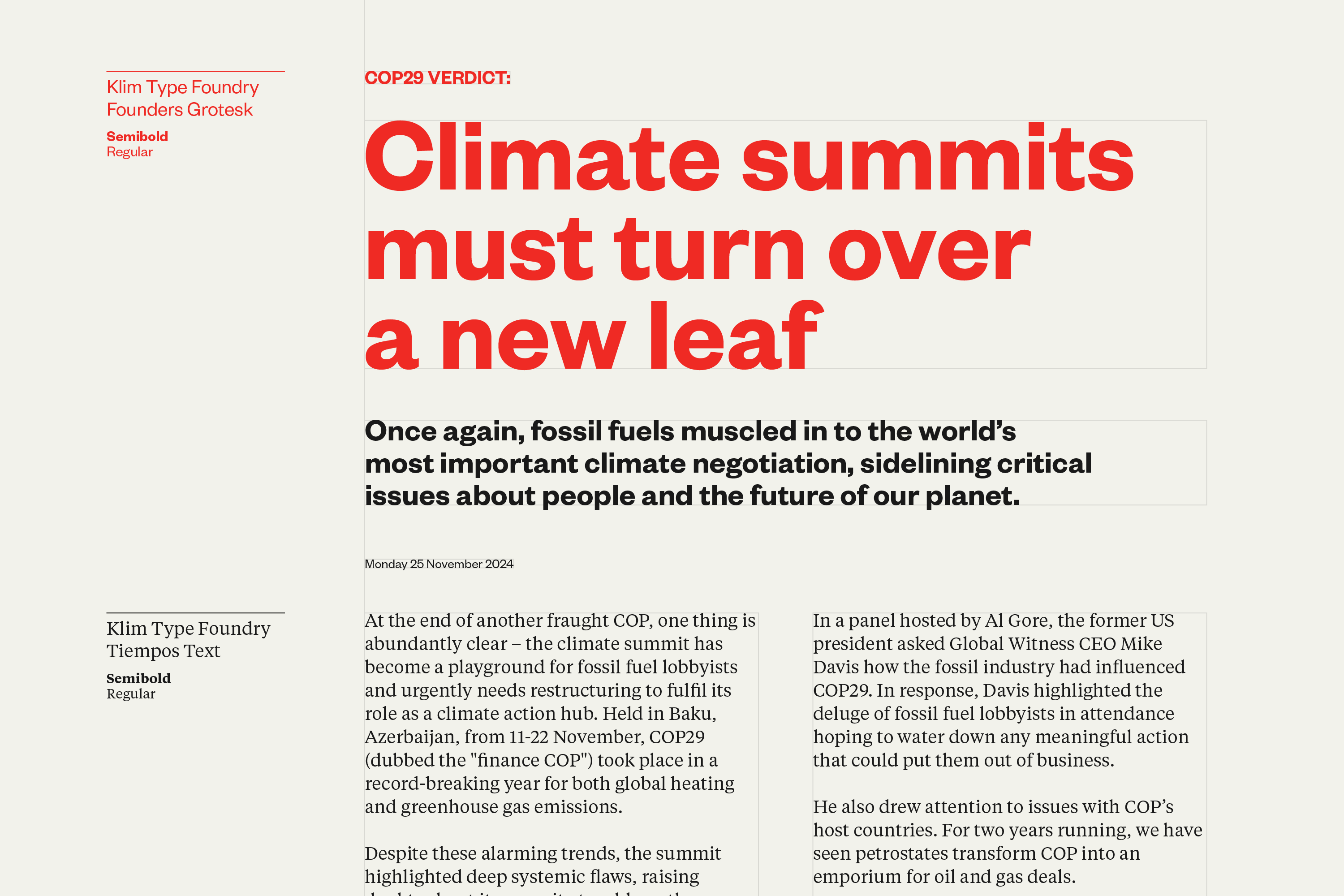
Font choice and typographic sensibilities are crucial to a brand that uses words to such powerful effect. The pairing of Klim Type Foundry’s modern sans ‘Founders Grotesk’ with elegant serif ‘Tiempos’, strikes a balance of personality and impact, with maturity and legibility. They’re capable of delivering serious facts and pointed opinions in equal measure, from headlines to longer reads.
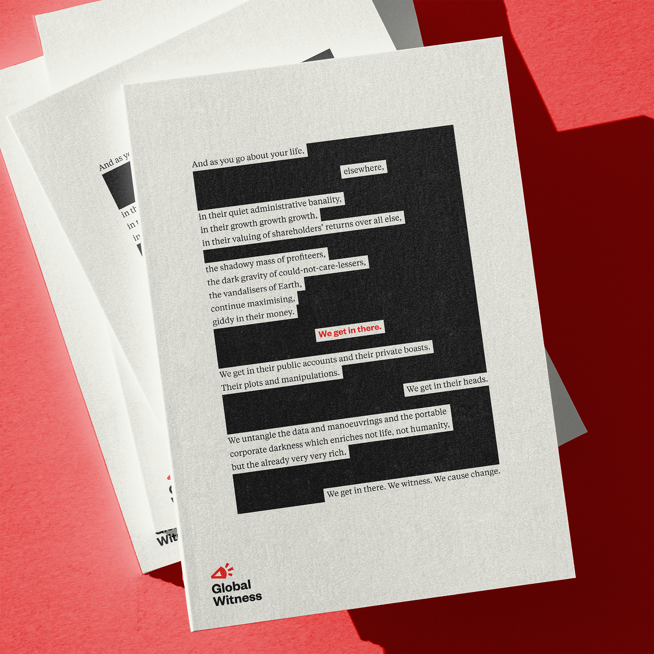
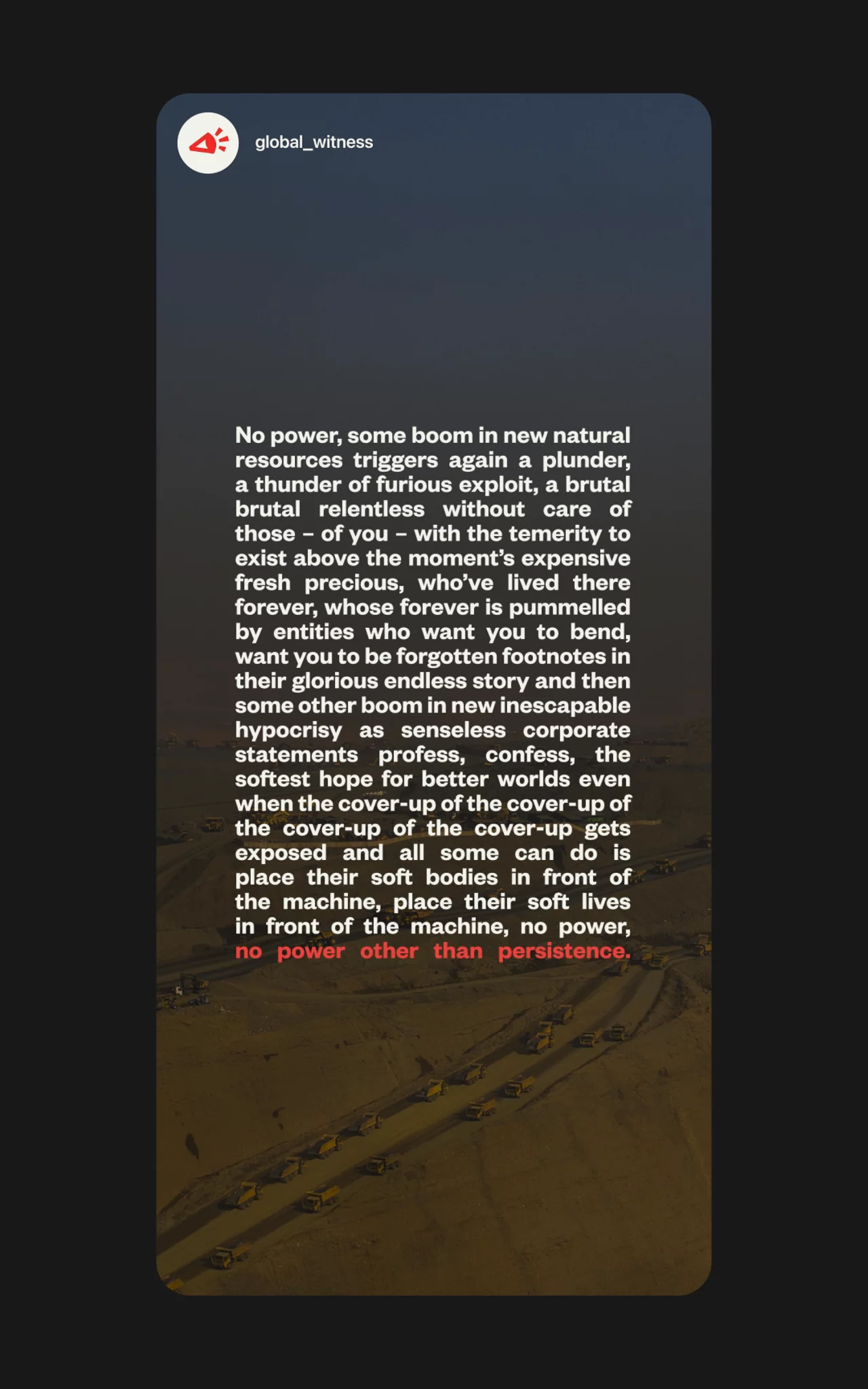
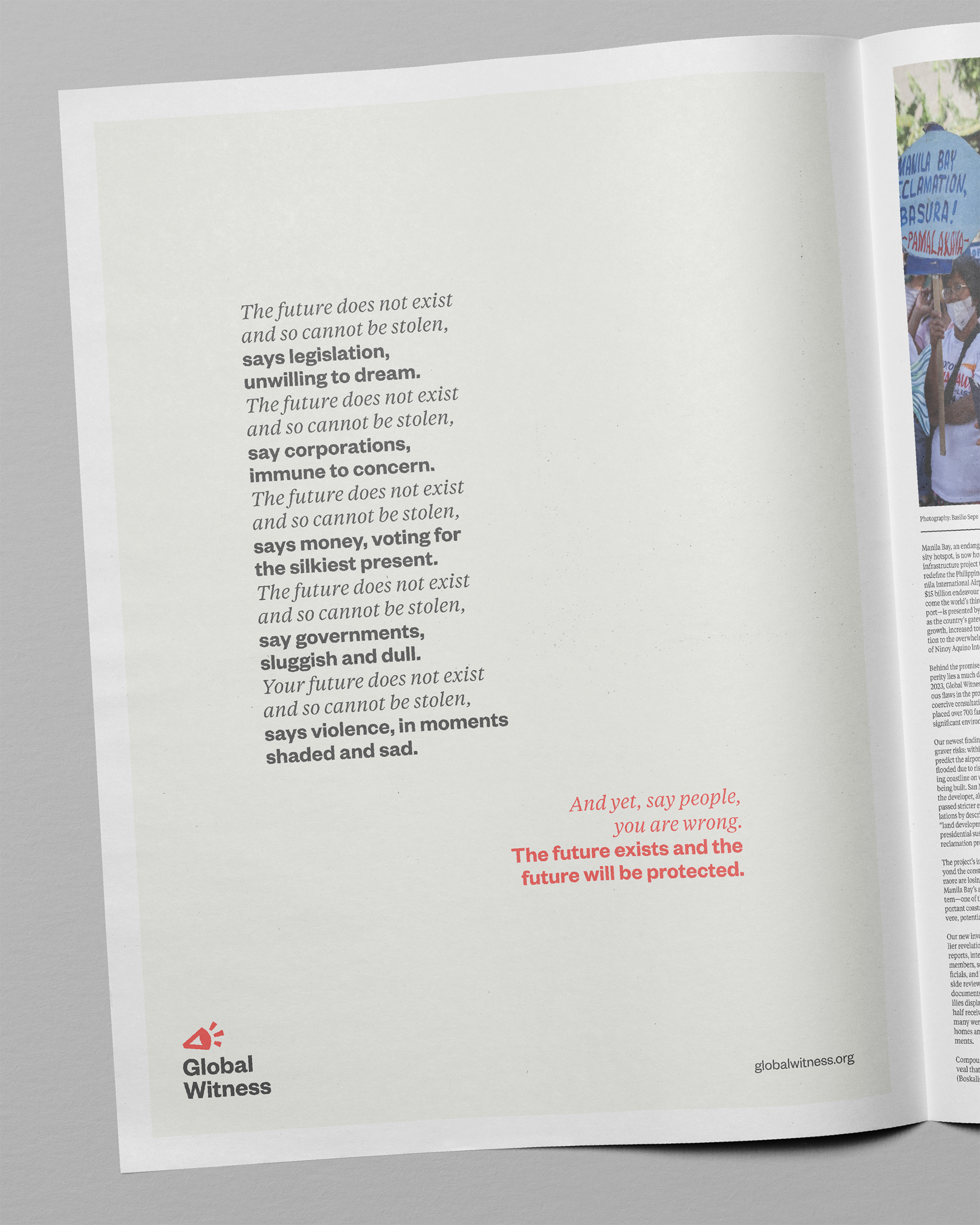
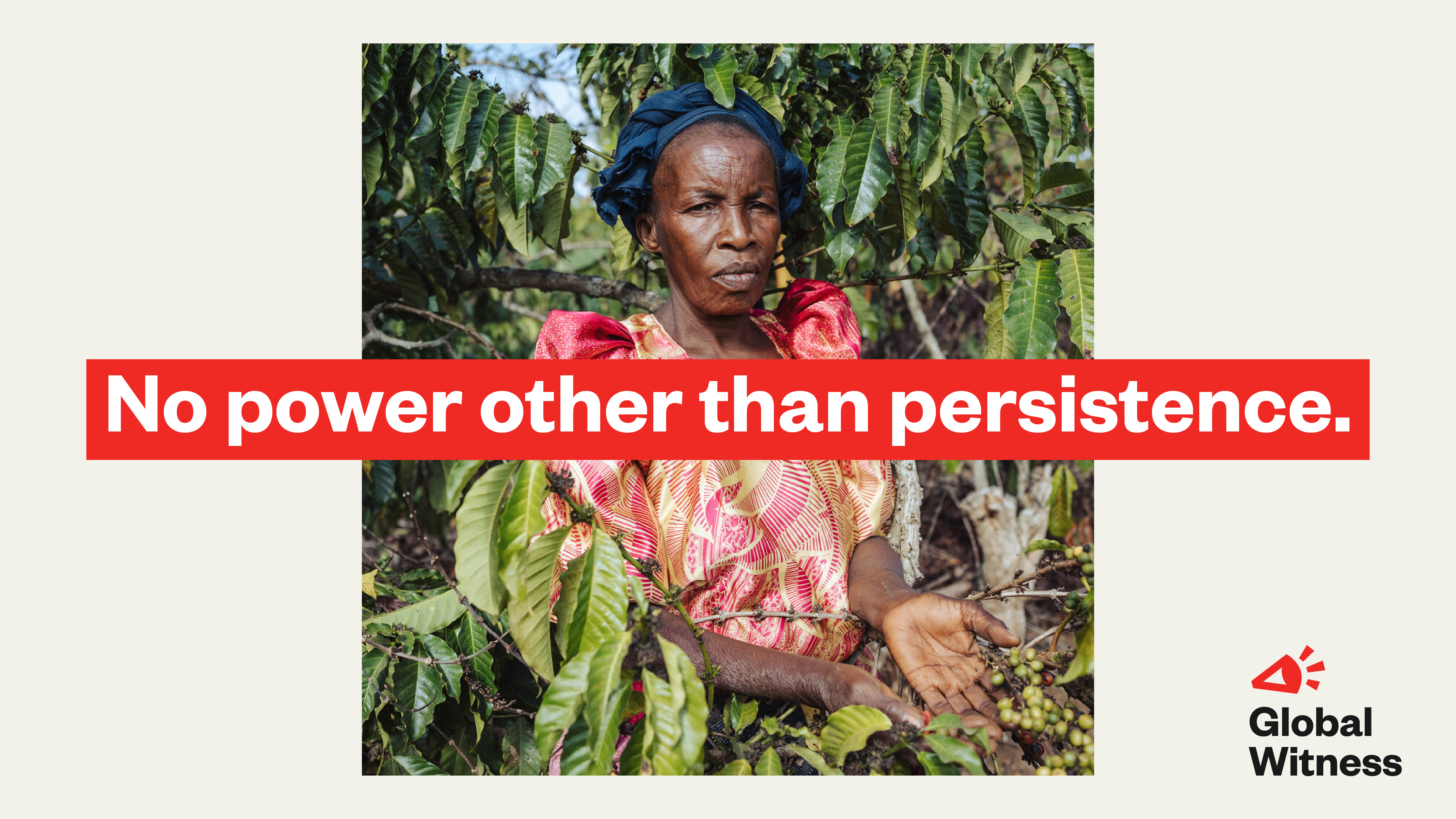
As part of the launch campaign, we collaborated with writer Thomas Sharp to develop three emotionally arresting pieces of creative language for a series of posters and digital campaign assets.