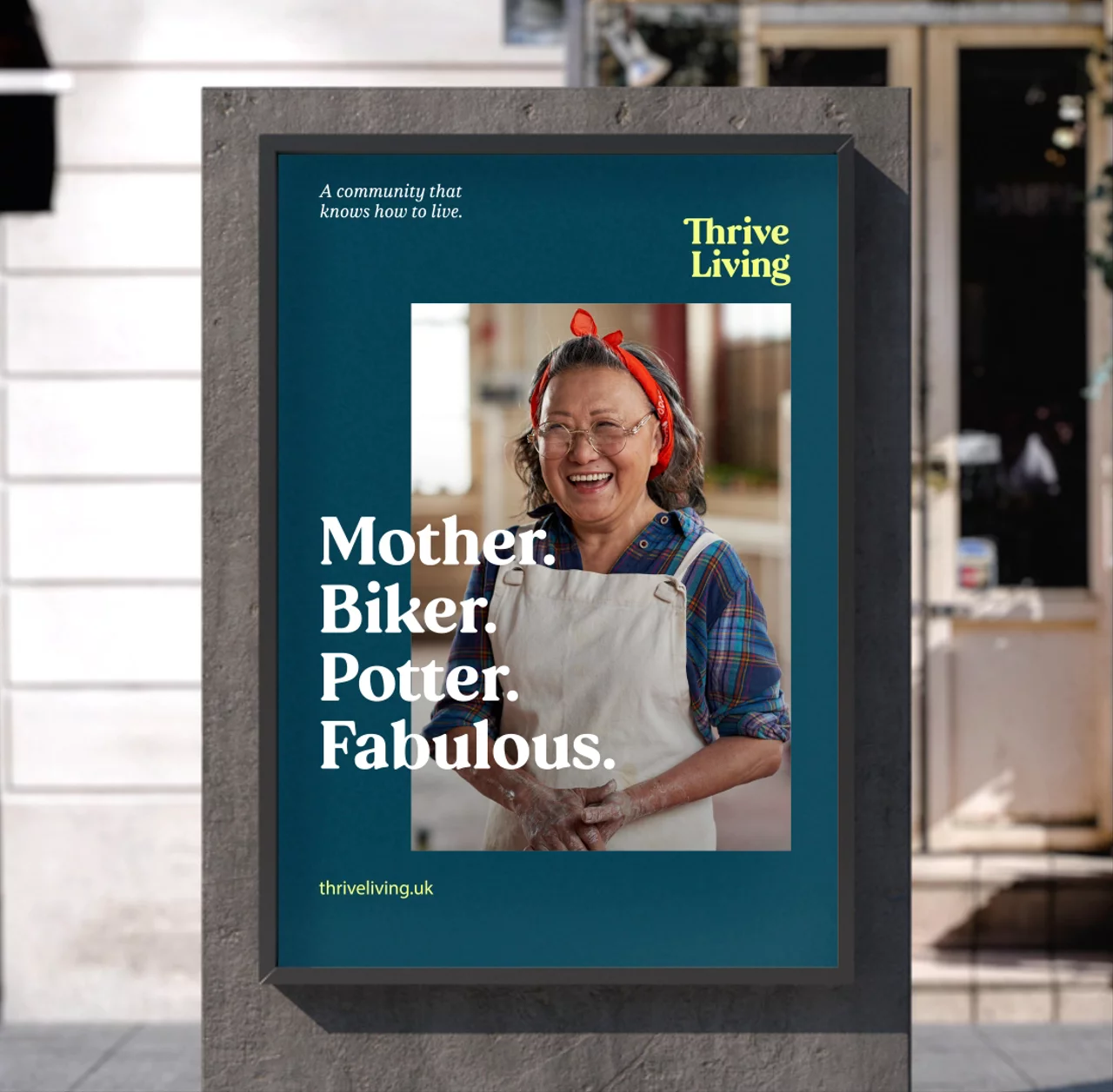
A community that knows how to live
Naming
Brand articulation
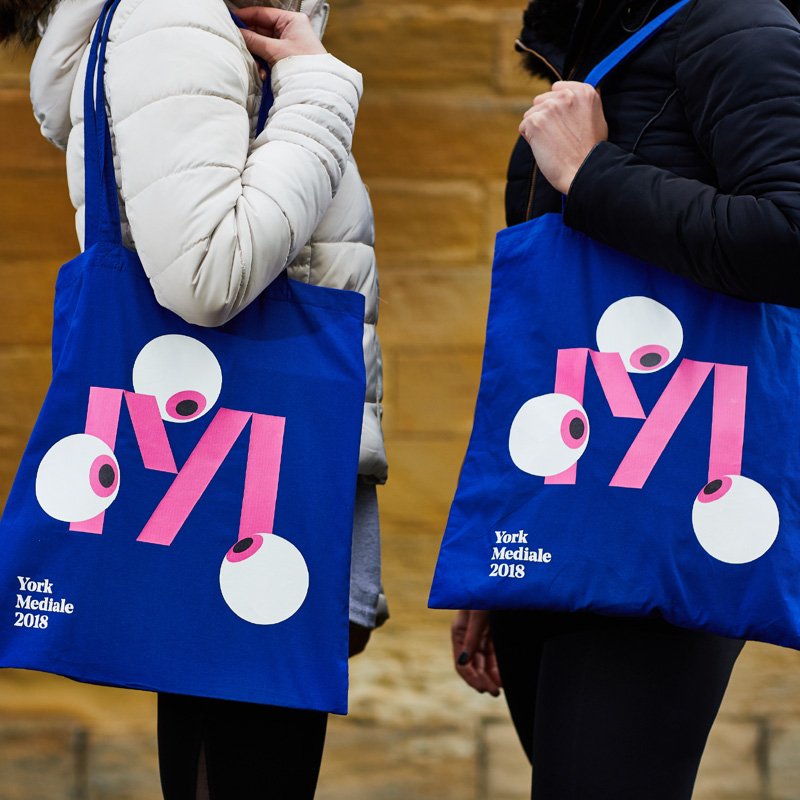
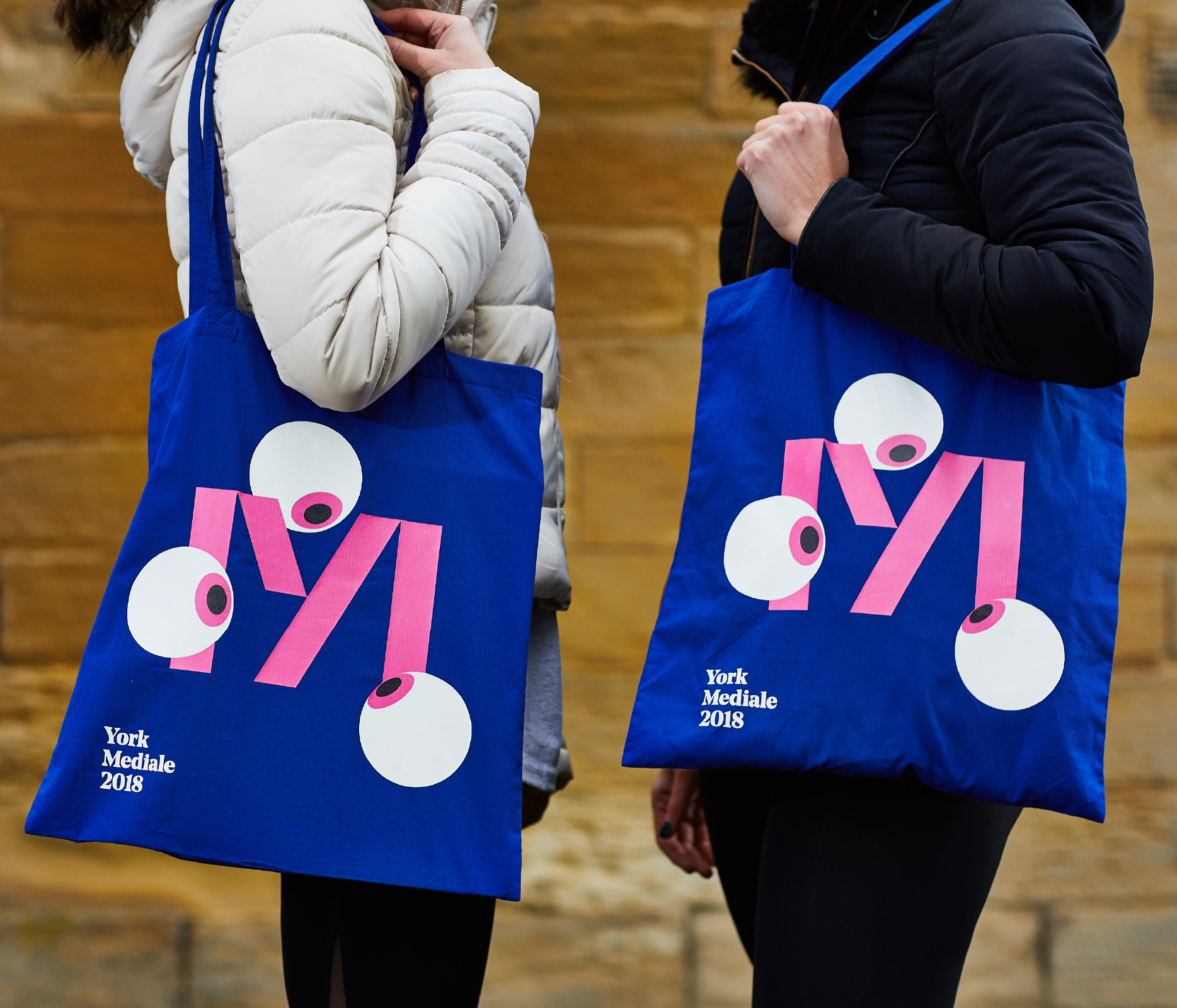
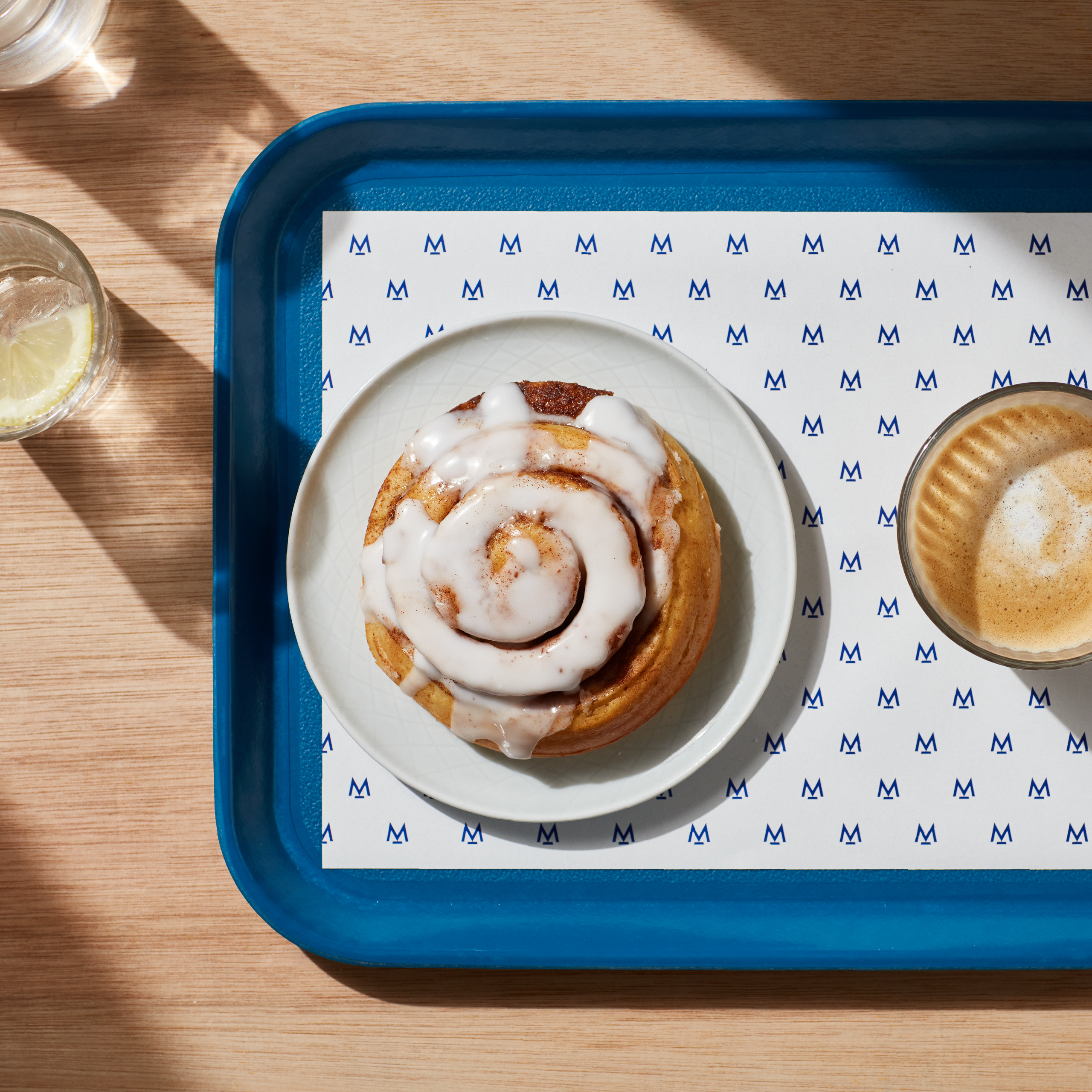
Visual identity
Verbal identity
Campaign direction
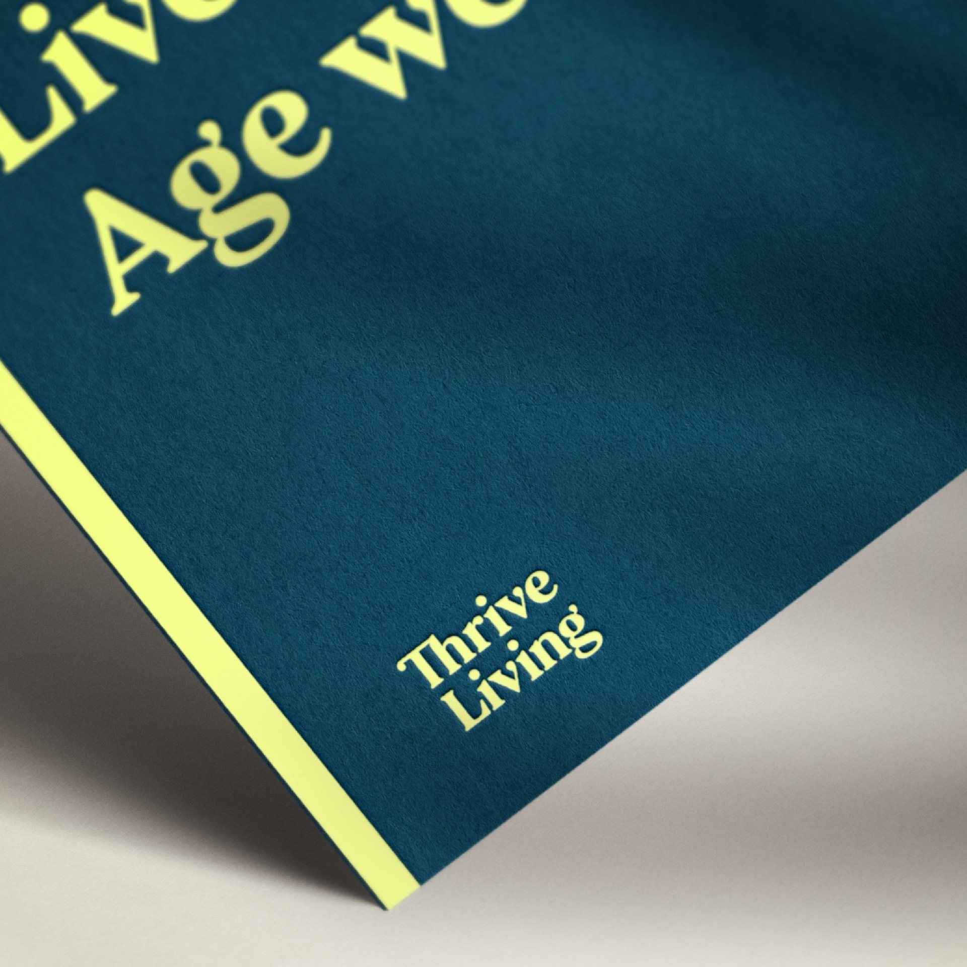
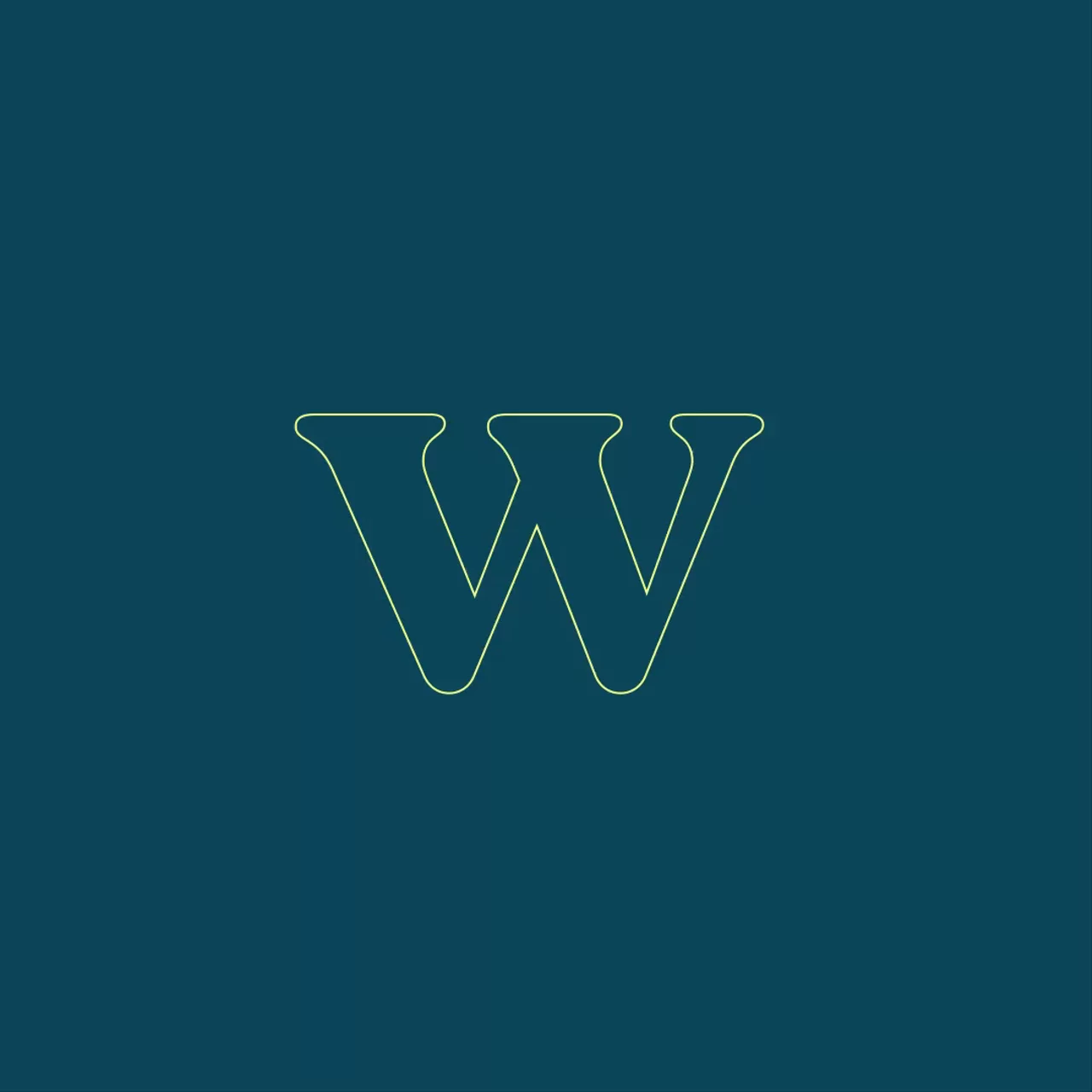
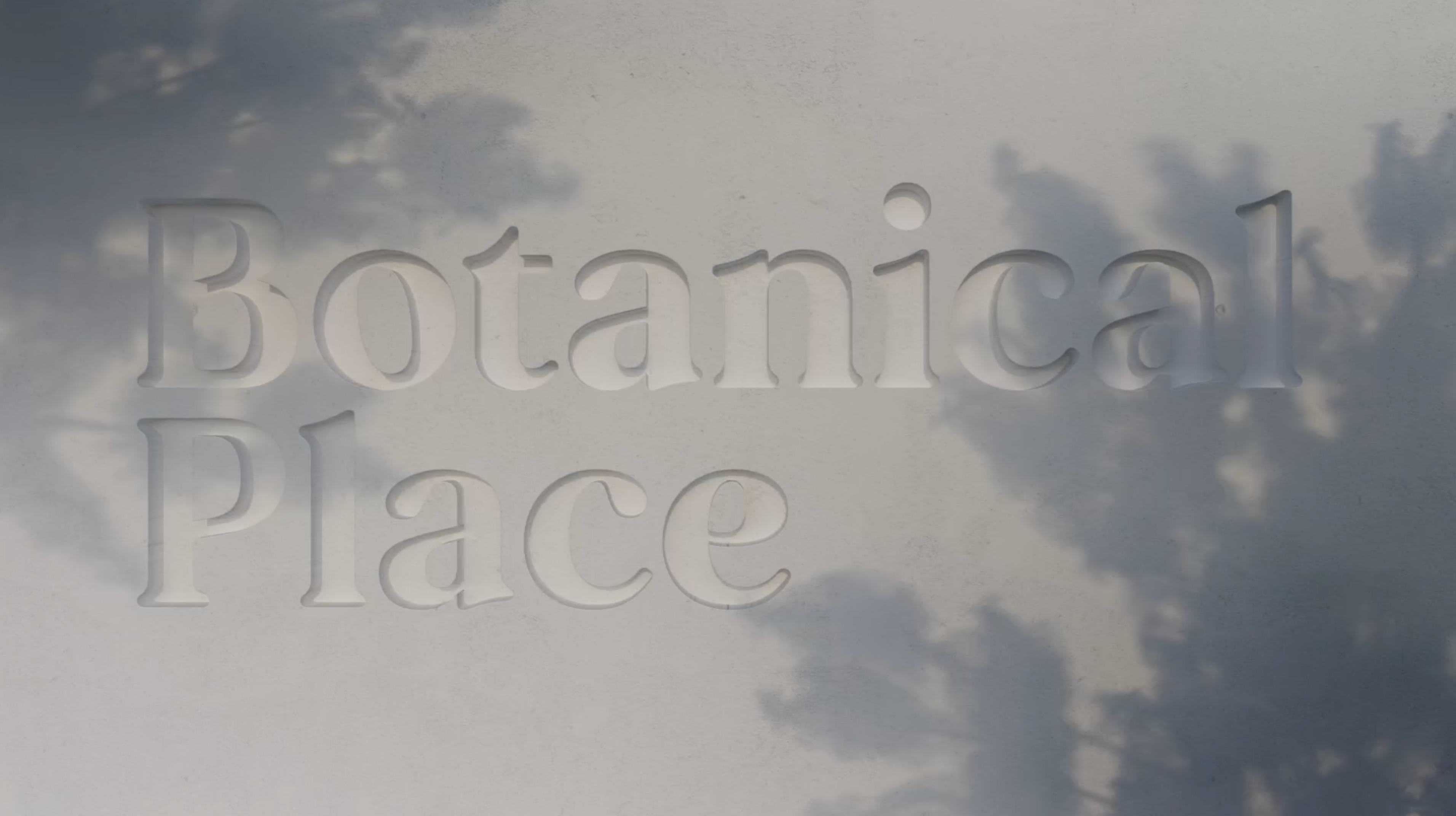
Bespoke typeface
Motion
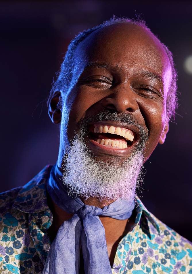
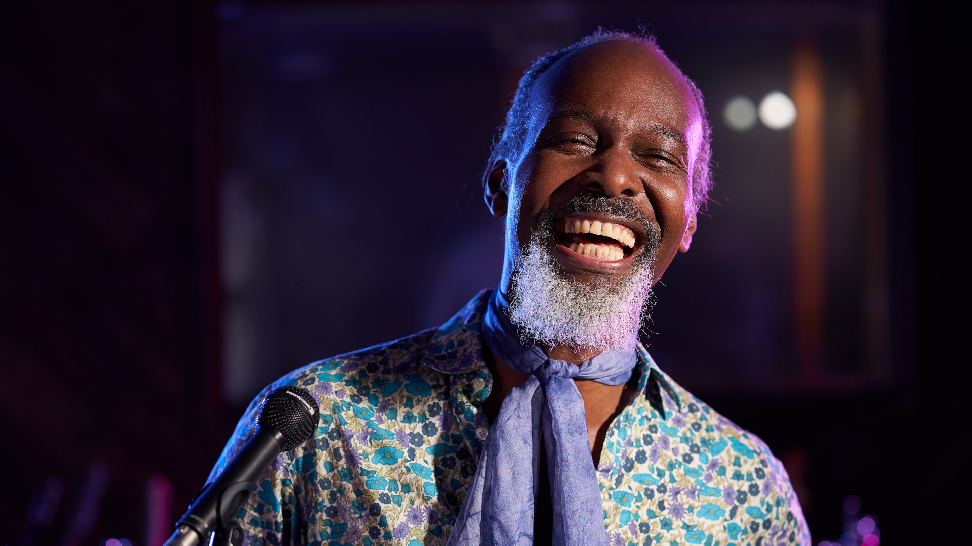
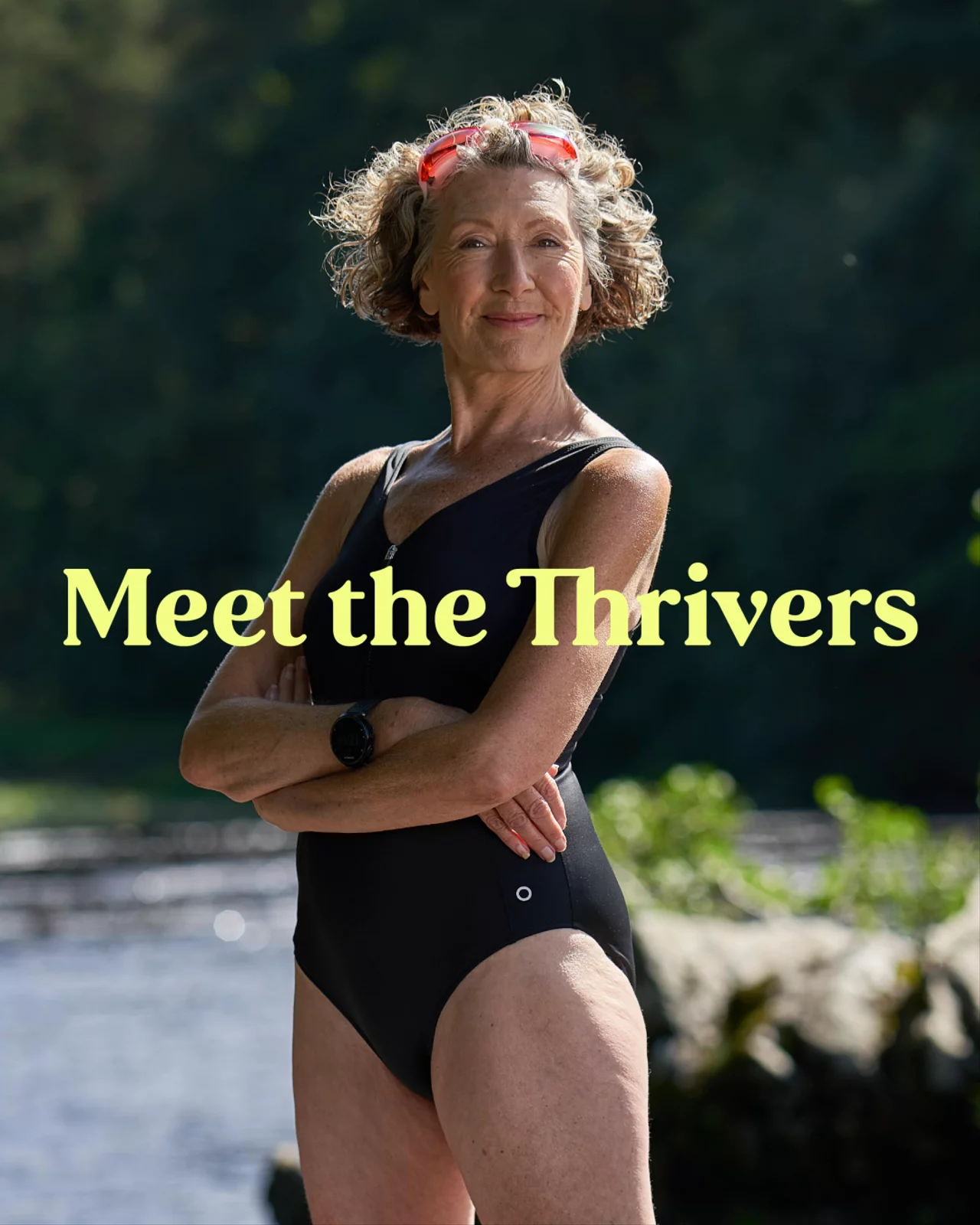
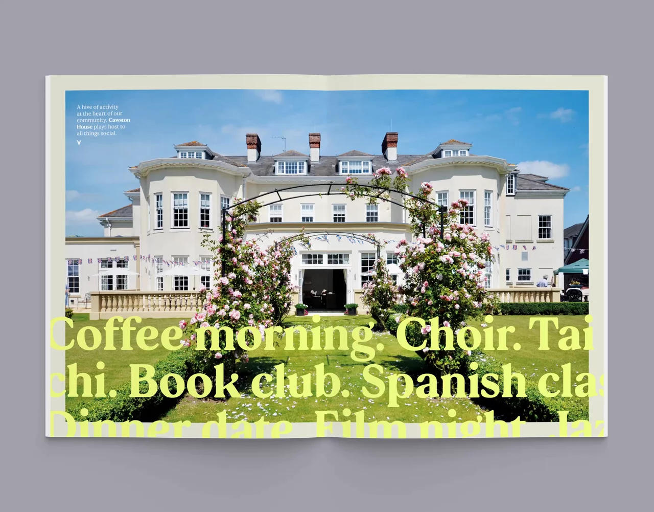
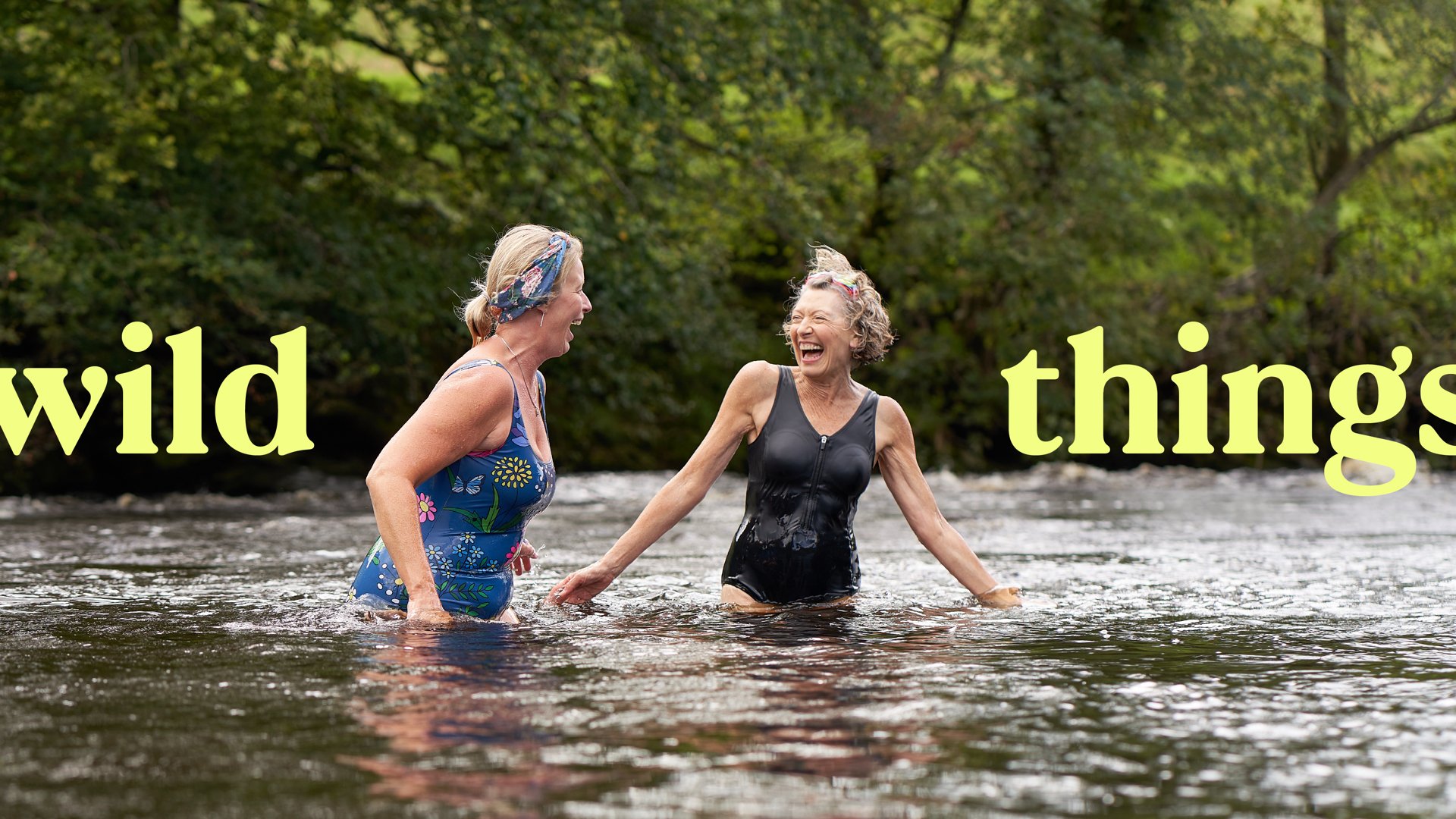
Photography
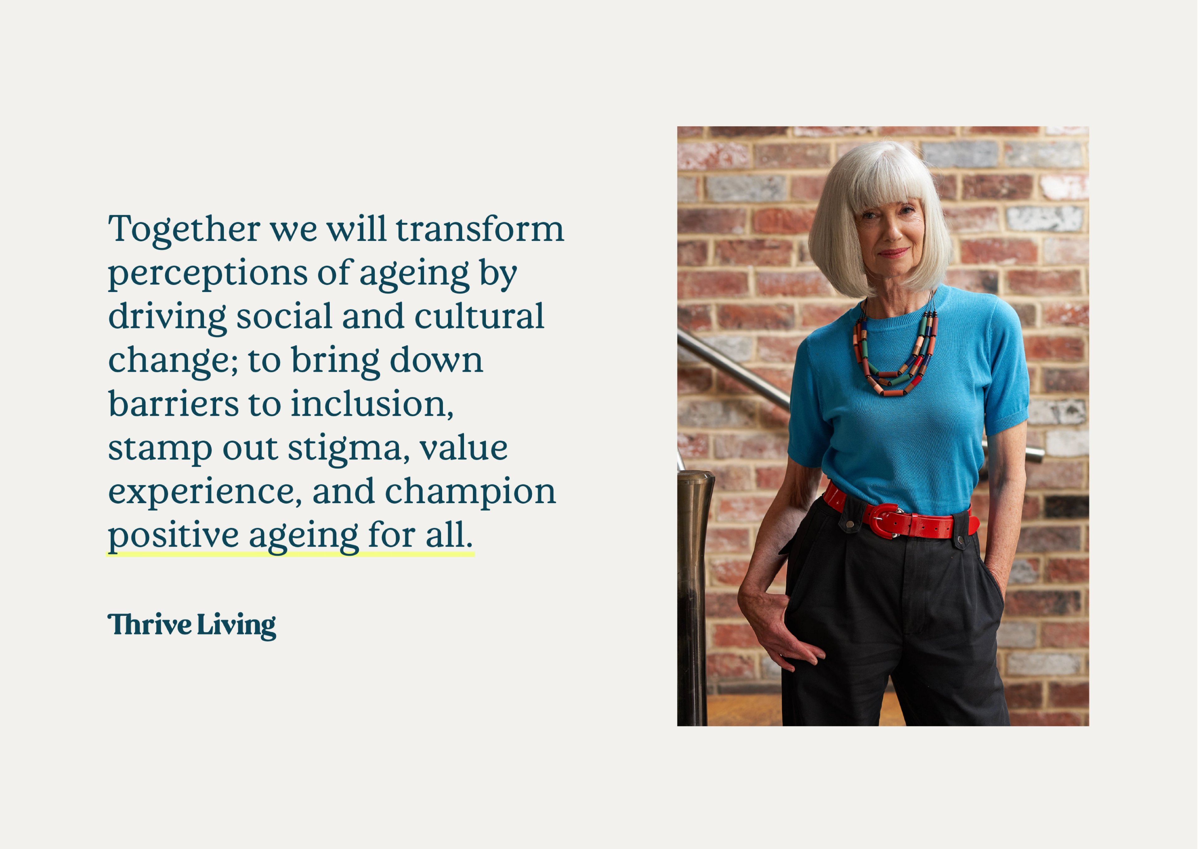
Retirement Villages believes change starts by giving people meaningful choice in how and where they live – that vibrant communities are made of people, not just bricks and mortar. We helped support them in their vision, from the initial insight, through to naming, articulation and brand expression. The result – Thrive Living – a celebration of real stories, by the people and communities that know how to live.

Thrive Living needed a bespoke typeface, with a gravitas and energy that did right by the people it represented. We developed a modern twist on the traditional serif that’s approachable, friendly and grown-up. It needed to be a hard-working, legible, digital typeface that also felt right at home when used loud and proud.
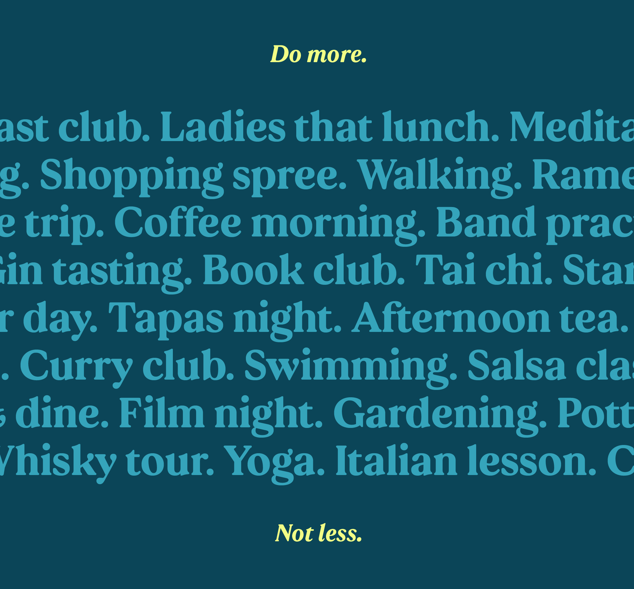
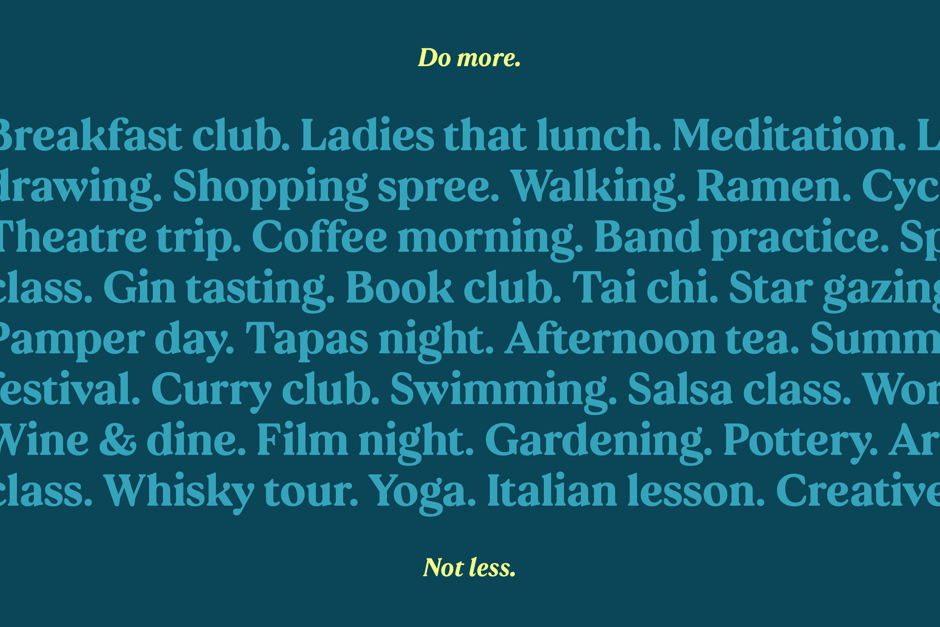

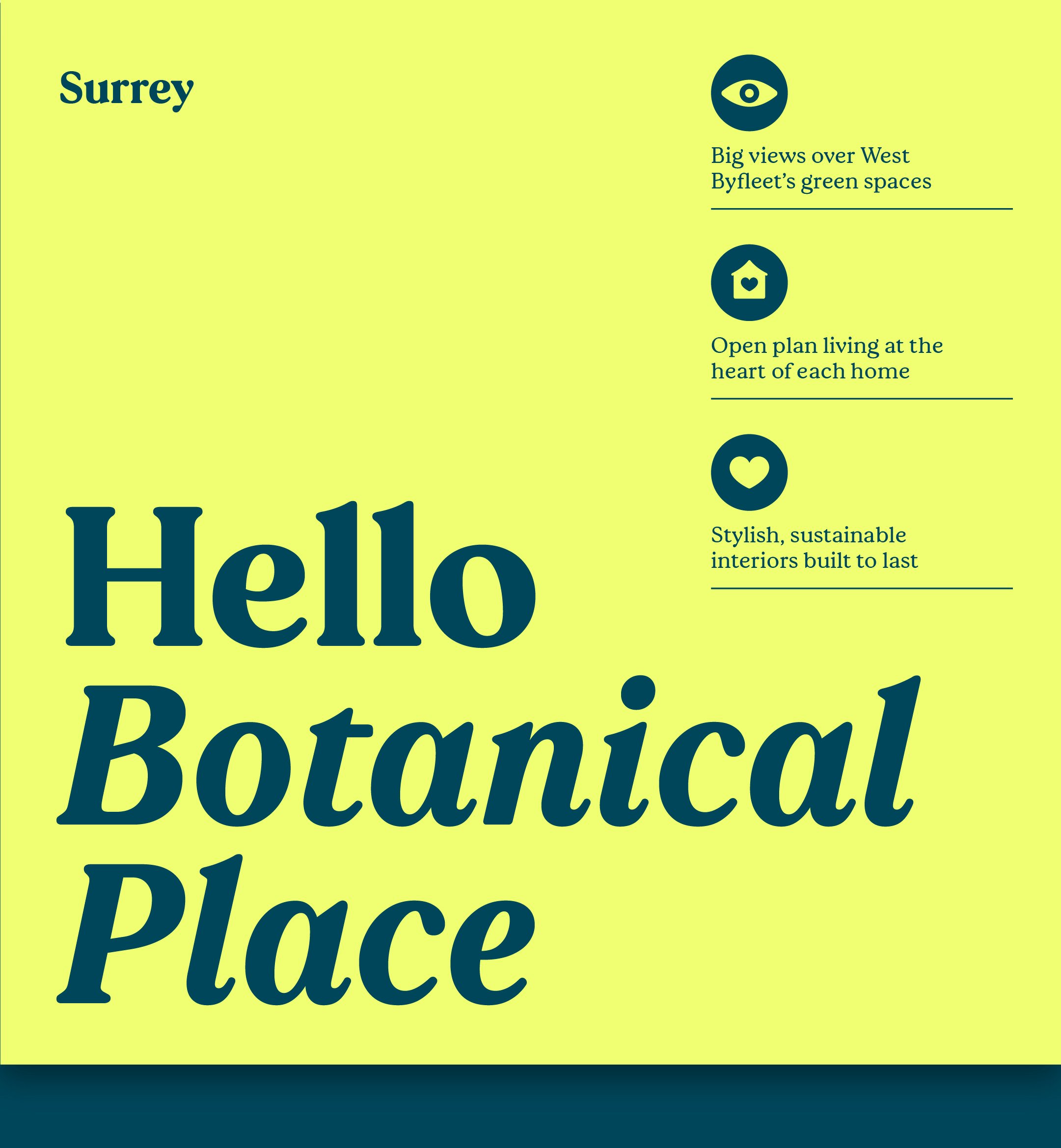
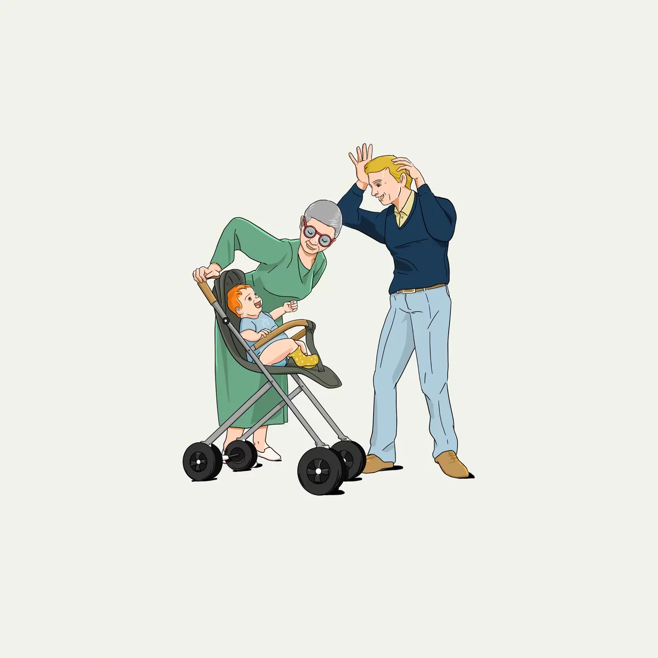
Bye bye beige. Photography, illustration, iconography, pattern and language all work together to capture a vibrant expression of people and community. A genuine, snapshot of experience – that could speak to new audiences and feel authentic to those who live it everyday – doing your thing, and doing it your way.
Special thanks to our talented collaborators on this project:
Typography: F37 Foundry
Photography: John Garon
Illustration: Paperface & Emil Paun
Digital: Perfect Storm